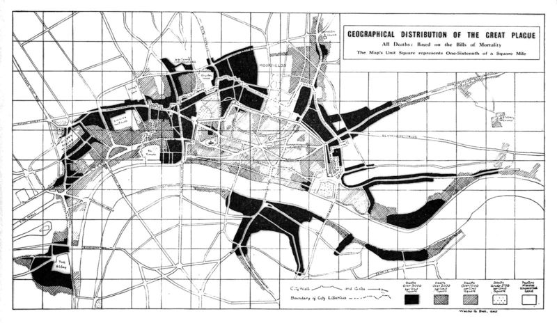
Chart of distribution of the Great Plague, 1665.
Item
Title
Chart of distribution of the Great Plague, 1665.
Description
This print depicts a chart showing the geographical distribution of deaths during the Great Plague in London from Walter George Bell’s The Great Plague in London in 1665. The darkest regions represent over 3000 deaths per unit square, the second darkest being over 2000 deaths, the third darkest being over 1000 deaths, and the lightest being under 500 deaths. Through the variations of shading used by the artist, it appears that the outskirts and/or most heavily populated areas of the city were the most affected by the Great Plague and that areas such as the Tower of London were not as severely impacted. The Great Plague became known as the “Poore’s Plague” because the lower classes were “unable to escape from it” (“The Great Plague in London”).
Contributor
The Great Plague in London in 1665
Creator
Walter George Bell
Date
1924
Format
Wood print
Language
English
Publisher
London: John Lane; New York: Dodd, Mead and Company
Rights
CC BY 4.0
Source
Wellcome Collection. History of Medicine, FL.43

