June 4th 1940
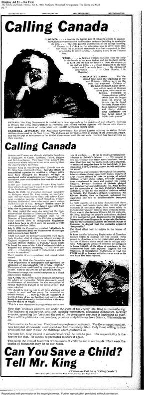
This advertisement was printed in the June 4th, 1940, edition of the Globe and Mail newspaper. The goal of this advertisement was to shame Prime Minister King into bringing over refugees from Europe. While some might see this advertisement as a wall of text the truth is that it was expertly crafted to convey the message of Calling Canada at just glace.
The main visual draw of the advertisement was the stark black and white photos of suffering British children. Judith Robinson gets the message across with the shocking image of the child crying out in the top left of the page. The image is so blown out that only the mouth and eye covering of the child can be made out. This image is a visual emphasize to not just the artist elements of the ad but also the textual. Without reading this article something horrible has happened to this child.
The other photograph is in the bottom right of the advertisement. It works much like the image above, with the blown out quality and textured faces. The focal point of this photo is the child, who looks to be wearing a sun hat. To his left is a man who looks worried. At first, I thought the photo was like the one above with the focus on the child but with further inspection this is not true. The photo is really about the man. He has a different value to the other figures in the photo with a clear expression. I believe that Judith Robinson chose this photo to convey not just the suffering of the children but also the parents.
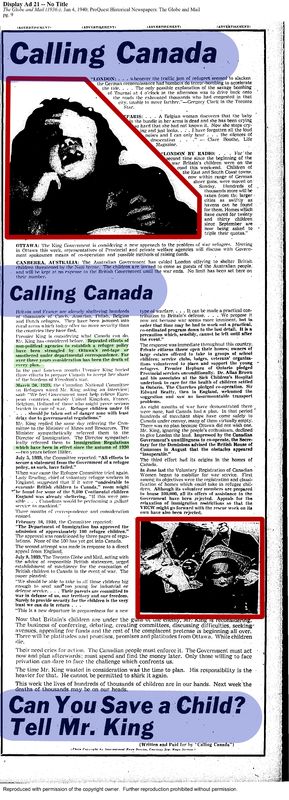
This advertisement uses open shapes for its composition. With the photo of the child starting this triangular shape that tapers down to the text.This draws the readers eye naturally down the page.
The unsung star of this advertisement is the font used. While font is not technically an element or principal of design Calling Canada uses font to proportion the article out, emphasis topics at a quick glace, creates a balance to the whole article and creates a sense of unity.
The balance that is created is called asymmetric balance with the photo on the top left balancing the photo on the bottom right. The proportion is created by the large blocks of text in the same font, splitting the ad into two parts. With both the bottom and top part of the advertisement having the same font and text size makes a type of frame around the ad.
No artist has been attributed to this advertisement but if pressed it would say this looks to be largely made by Judith Robinson. When NEWS was published there are many different types of fonts being used much like the unusual font of this ad. If she did not create it than this is an inspiration for her later works.
Highlights of the advertisement
Red is the invisible shapes
Green Judith bolds texts to show importance of facts and dates.
Blue is the font that creates the natural boarder and proportions the ad

