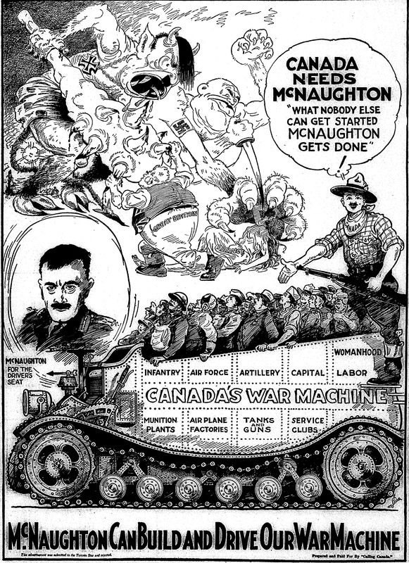
Tanks Ad
The June 21st, 1940 full-page advertisement, titled Canada’s War Machine was created in response to Commander Andrew McNaughton's (depicted heroically on the center-left) approach to further expand Canadian artillery productions as the 'correct' way to dominate and defeat Germany. It again features the effective use of contrast as well as space and movement. It flows from left to right with a very stable base, which is notably different from Judith Robinson’s more dynamic style (making this a likely work of another member of the trio or an outsourced commission), that also allows the eye to be directed through all the different registers from the curves of the wheels, the track, the almost fantastical design of the tank with its front resembling that of a train, and through the infantry despite these elements having more rigidness in real life. The scattering of the text below the tank, across it, beside and above it also assists in creating a leveled effect. The placement and proportion of the Allies and the Army gives them a more solid weight, whereas the demonic Axis iconography in the background have a lighter feel to them as if they could be blown away.
